
Meh new skin
| 5uper Mario |
|
|---|---|
|
Took forever.
Mainly cause I'm not used to converting skins from templates But I'm proud to say it looks amazing! http://98.228.103.157/forum/ I don't know... what do ya'll think? I put up a poll fer ya'll too  With a few more fine tuning and table color changing, it will turn out to be a great Contonti Skin! C&C please. Oh by the way I call it WAR-Dark |
| robotik |
|
|---|---|
 Try uploading it to a real website. |
| 5uper Mario |
|
|---|---|
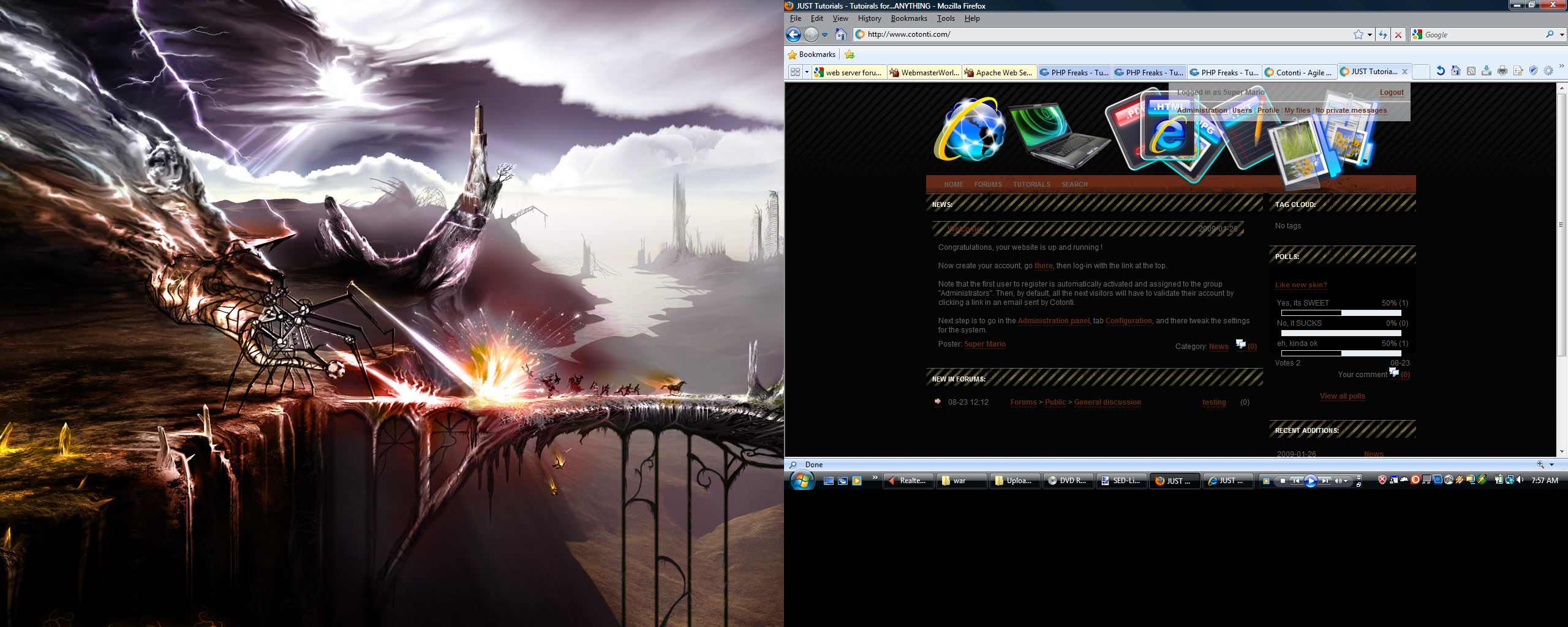
# robotik : Using IE I see? And no, I'm fed up with "real" hosts And I'm running like 5 other successful working sites... I removed the stupid code I added Should work now... Added 5 minutes later: dang My site in IE looks kinda bad... See, dats why I use FireFox Added 11 minutes later: ok well IF anyone still get errors, heres a screenshot: http://www.cotonti.com/datas/users/kokpo_107.jpg Sorry for dual screen I don't have time to cut it. C&C Please. Dit bericht is bewerkt door 5uper Mario (2009-08-23 22:58, 16 jaren ago) |
| pieter |
|
|---|---|
|
Looks nice.
Some remarks. The page is in the center of the windows if you are in home and search. For forums and tutorials, it is not centered, but displayed left. Link color is nice. But hover color is horrible. ... can we help you ...
|
| robotik |
|
|---|---|
|
I used Chrome and it worked... stupid IE
 I like the skin, but I'm kind of sorry to say that is looks too much like SED-Light, and not enough like its own skin. Dont take my comments to seriously though, as I could personally do no better. The graphics are pretty awsome though, I like them. Added 5 minutes later: Also, one more thing:  Dit bericht is bewerkt door robotik (2009-08-24 00:34, 16 jaren ago) |
| SunChase |
|
|---|---|
|
Not a bad work.Buuuut - I cant see the text...
The titles are completely unreadable. The background of the blocks arent solid.You can clearly see where the bg picture ends. Also the text is hard to read.Dark-grey on a black background. [url=http://ka13.orgfree.com]KA13[/url] - The essence of creativity
|


